
Normalization module
This module allow to normalize expression module results.
- Name: normalization
- Available: Only in local mode
- Input port:
- input: expression file in TSV format (format: expression_results_tsv)
- Output: Control graphics, LaTeX report and count matrices (raw, pooled and normalized)
- Optional parameters
- Configuration example:
| Parameter | Type | Description | Default value |
|---|---|---|---|
| r.execution.mode | string | The R execution mode. The available mode values are: process, rserve and docker. | process |
| rserve.servername | string | The Rserve server name to use in rserve execution mode | not set |
| docker.image | string | The Docker image to use in Docker execution mode. | genomicpariscentre/deseq:1.8.3 |
<!-- Normalization step -->
<step id="mynormlizationstep" skip="false" discardoutput="false">
	<name>normalization</name>
	<parameters />
</step>
Required R packages installation
Eoulsan normalization module use R with DESeq and FactoMineR packages as statistical backend. Normalization module was tested with R 2.15, DESeq 1.8.3 and FactoMineR_1.20. You need to install two R packages on your computer or Rserve server:
$ sudo R
> source("http://bioconductor.org/biocLite.R")
> biocLite("DESeq")
> install.packages("FactoMineR")
Interpreting output files
Null count proportion barplot
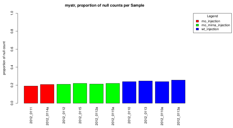
This barplot represent the null count proportion in all sample.
This gives a first idea of expression differences.
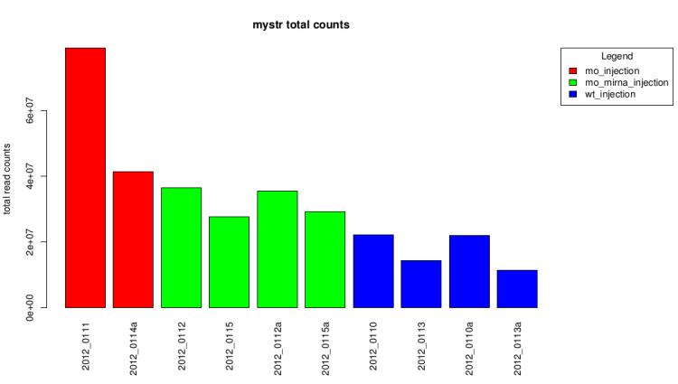
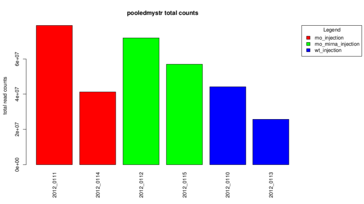
Total count barplot
This graph represent the total counts for each sample.
It also give a first idea of expression differences.
Raw data (before technical replicates pooling and normalization)
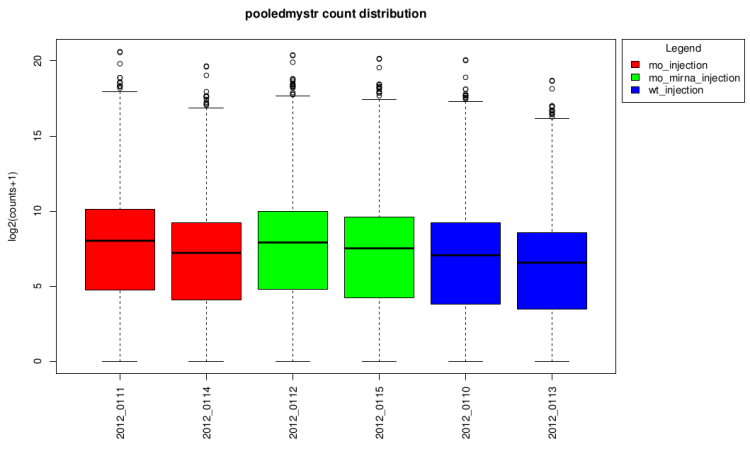
After technical replicates pooling
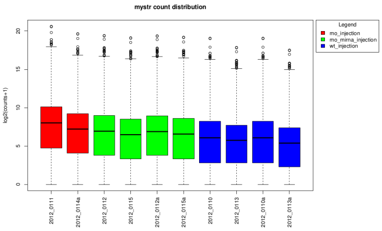
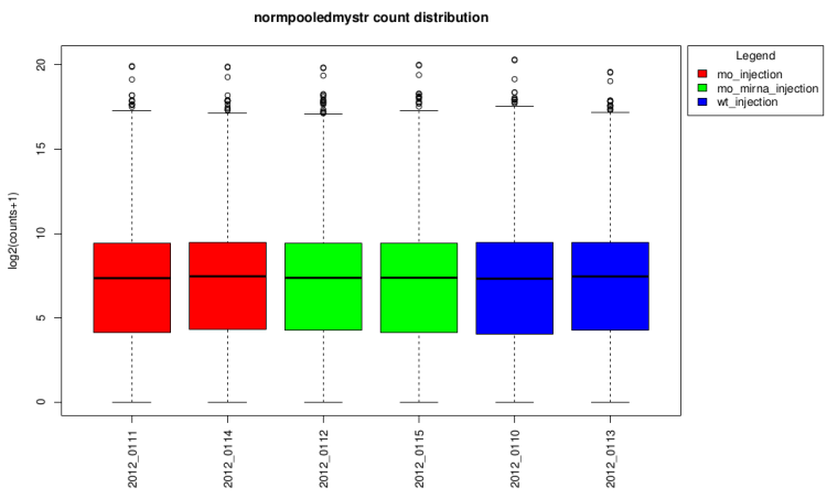
log2(counts + 1) distribution boxplot
This type of graph is useful to see if normalization was
performed well. When all boxes are aligned or at least the
median, the normalization worked well.
On raw data
After technical replicates pooling
After normalization
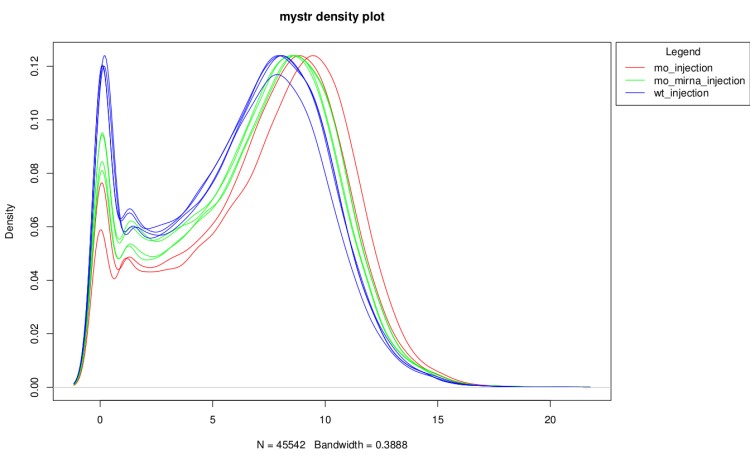
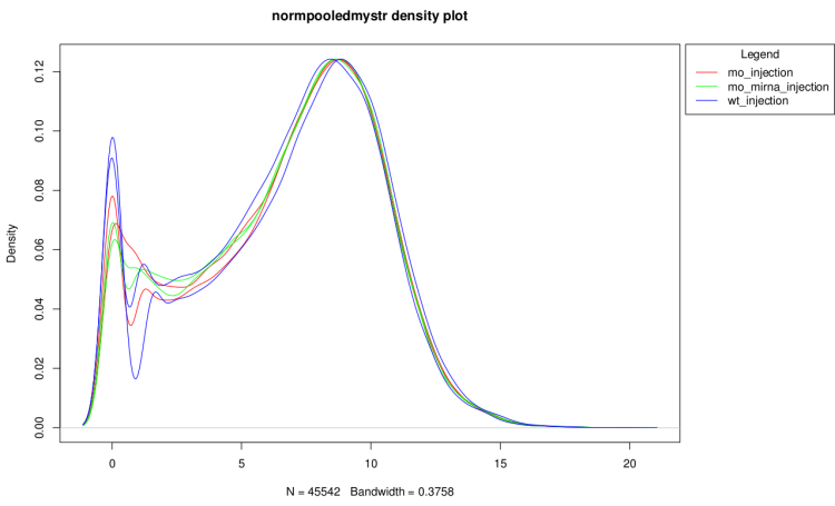
log2(counts + 1) distribution density
This graph show the distribution profiles of each sample.
It is useful to verify that technical replicates count
distributions are close enough to pool them and to see
if normalization have corrected well distribution
differences.
On raw data
After technical replicate and normalization
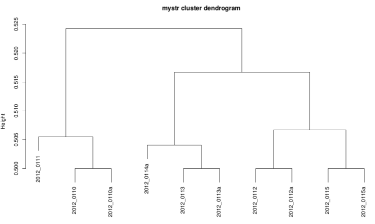
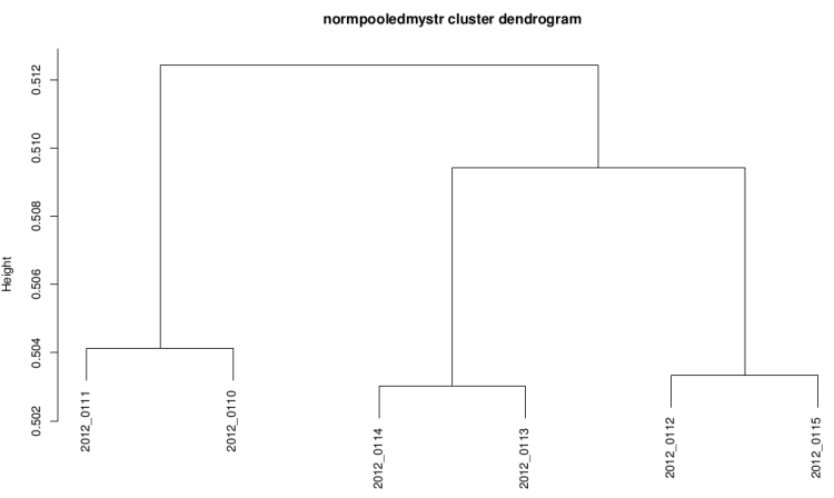
Clustering dendrogram
This graph is plotted with hclust R function with the
ward method and the distance used is 1-(correlation/2).
It it useful to see if replicates are grouped
together.
On raw data
After technical replicate and normalization
PCA scatter plot
This graph have the same goal than the cluster dendrogram
but it is more easy do read.
On raw data
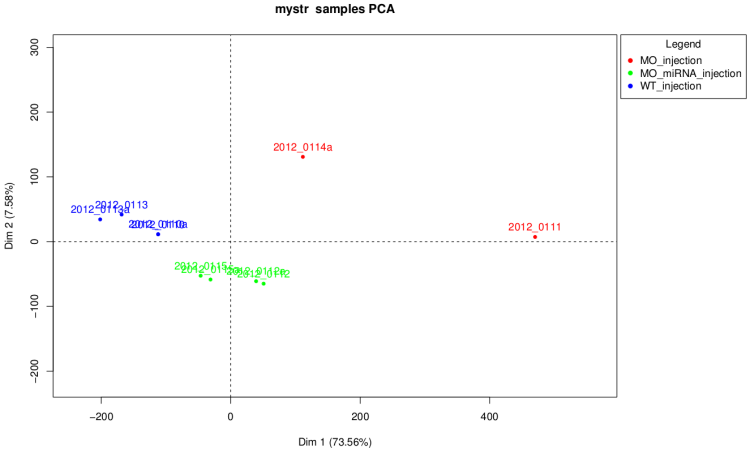
Warning : as we can see on this graph if
some of the samples have a number of total count very
higher than the others. The first dimension of the PCA is the count
number and the graph isn't really informative in this case.
After technical replicate and normalization
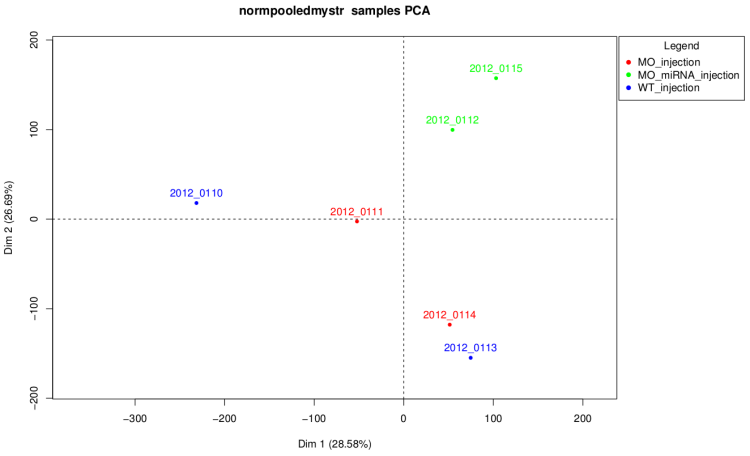
On this graph like on the corresponding dendrogram we
can see that samples of MO_injection and WT_injection are
grouped together which is not waiting. Actually, in this
experiment injection was performed at 2 different times and
these two conditions are control conditions of 2 strains,
so these graph shows that there is an "injection
time effect" stronger than the difference between the
2 strains.
Count matrix
This module also provide a raw count matrix and a normalized
count matrix which can be use for other analysis.